
Graphics are really important in data science. So a useful library to know is matplotlib.
Matplotlib is a plotting library for the Python programming language and its numerical mathematics extension NumPy. It provides an object-oriented API for embedding plots into applications using general-purpose GUI toolkits like Tkinter, wxPython, Qt, or GTK.
To install matplotlib, use the following command:
pip install matplotlib
# or python 3
pip3 install matplotlib
Then import the module using the following command:
import matplotlib.pyplot as pltor if you want the whole library:
import matplotlib as mplNote: the
pltis a common alias for thematplotlib.pyplotmodule. The same is true formplfor the root modulematplotlib.
Data visualization & plotting is the discipline of understanding and detecting underlying patterns, properties and trends in data using visual representations.
Matplotlib is a library for producing publication-quality figures. Matplotlib was initially designed by John D. Hunter in 2003 to serve two purposes:
Matplotlib, much like python itself, gives users complete control over the appearance of their plots while also offering a powerful default system.
One important big-picture matplotlib concept is its object hierarchy.
As seen before, a basic plot can be created using the plot function.
This one-liner hides the fact that a plot is really a hierarchy of nested Python objects. A hierarchy means that there is a tree-like structure of Matplotlib objects underlying each plot.
The matplotlib diagram above consists of a number of components.
"A figure object is the outermost container for a Maplotlib graphic, which can contain multiple axes objects. You can think of the Figure object as a box-like container holding one or more Axes objects (actual plots). Below the axes in the hierarchy are smaller objects such as the actual Y and X axis of a plot, individual lines, legends, and text boxes" (Solomon, 2021).
Almost every element of a chart can be customized in Python as an object.
As mentioned, Matplotlib graphics can contain many elements that one can customize, depending on whatever particular need.
The figure below includes an extensive showcase of the elements in a plot.

In the figure above,
The subplot function is used to create multiple plots in a single figure.
It returns a Figure object and a list of Axes objects.
Commonly these are named fig and ax respectively.
import matplotlib.pyplot as plt
fig, ax = plt.subplots()
From here you can perform all kinds of customizations to the plot.
So let's generate some data using numpy.random and plot it.
import matplotlib.pyplot as plt
import numpy as np
np.random.seed(0)
fig, ax = plt.subplots()
ax.plot(np.random.rand(20))
ax.set_title('First Graph')
plt.show()
TODO add plots when CMS/Object store is ready
You can also create multiple subplots in a single figure.
n_rows = 2
n_cols = 2
fig, ax = plt.subplots(n_rows, n_cols, figsize=(10, 10))
for row_num in range(n_rows):
    for col_num in range(n_cols):
        a = ax[row_num][col_num]
        a.plot(np.random.rand(20))
        a.set_title(f'Plot ({row_num + 1}, {col_num + 1})')
fig.suptitle('Main Title')
fig.tight_layout()
plt.show()
By assigning indices to the ax object, you can access each subplot individually.
Here by using both a inner and outer list,
you can arrange subplots in a grid.
Of note is the figsize parameter.
This is used to specify the size of the figure.
The figure.suptitle method is used to set the title of the figure.
And the figure.tight_layout method is used to automatically adjust the
Crucially for almost any usecase of matplotlib,
the plt.show() function must be called to display the plot.
A line plot is a plot that displays information as a series of data points called "markers" connected by straight line segments. Line graphs are used to track changes over a period of time or sequence, like distance. They can also compare data sets over the same independent variable, normally represented in the X axis.
To create a line plot in matplotlib,
use the ax.plot method (Matplotlib 2021).
For example:
import matplotlib.pyplot as plt
import numpy as np
fig = plt.figure()
ax = fig.axes()

x = np.linspace(0, 10, 1000)
ax.plot(x, np.sin(x))
TODO: add plot when CMS/Object store is ready
A bar plot is a plot that displays information as a relationship between a numeric and a categorical variable, or ordinal variable. Each entity of the categorical variable is represented by a bar. The size of the bar is proportional to the value of the numeric variable.
In Matplotlib, the bar() function is used to create bar plots (Matplotlib 2021).
The parameters to be used with the axes object of the bar() function are as follows:
bar(x, height, width, bottom, aligh)This example shows how to create a bar plot using the bar() function.
# Use pyplot for our plotting constructs
import matplotlib.pyplot as plt

# Define the dataset
courses = ['Data Science', 'Python', 'R', 'Statistics', 'Machine Learning']
students = [30, 45, 8, 25, 38]

# Create a figure to draw on
fig = plt.figure()
ax = fig.add_axes([0, 0, 1, 1])
# Add the bar chart to the subplot
ax.bar(courses, students)
plt.xlabel('Courses')
plt.ylabel('Enrolled Students')
plt.title('Student Enrollment by Course')
TODO: add plot when CMS/Object store is ready
A scatter plot is used to determine relationships between two different data dimensions. In a scatter plot, the X-axis is used to measure one dimension (or variable), and the Y-axis is used to measure the other. If both variables increase at the same time, they have a positive relationship. If one variable decreases while the other increases, they have a negative relationship. Sometimes, the variables don't follow any pattern and have no relationship.
In Matplotlib,
use the scatter() function to create scatter plots (Matplotlib 2021).
The parameters to be used with
the axes object of the scatter() function are as follows:
scatter(x_coords, y_coords, shape, colors, alpha)The example below shows how to create a scatter plot in Matplotlib:
import matplotlib.pyplot as plt
import numpy as np
# Create data
N = 500 # Create 500 random numbers
x = np.random.rand(N)
y = np.random.rand(N)

# Create the scatter plot using the scatter function
plt.scatter(x, y, c='g', alpha=1)
plt.title('Scatter plot using Matplotlib')
plt.xlabel('x-axis')
plt.ylabel('y-label')
TODO: add plot when CMS/Object store is ready
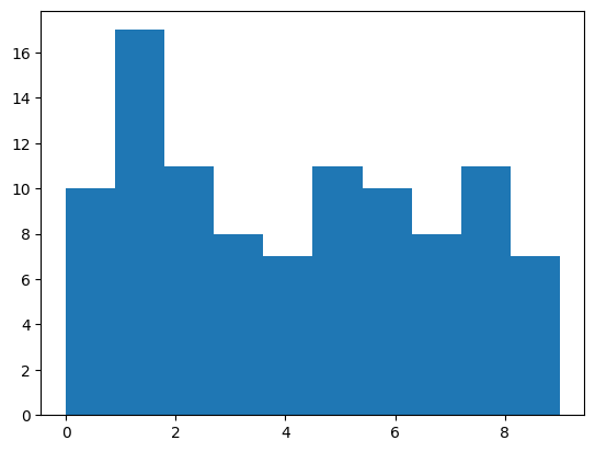
Say you have a list of randomly chosen numbers, perhaps chosen using numpy, how would you want to visually inspect the distribution? Histograms are the best way to plot this relationship.
Histograms are concerned with the outcomes of random variables. They examine the distribution of possible outcomes of a single random variable. To learn more read the previously linked notes on the theory, in the more broad probability theory notes.
To do this, we will use the hist function from the matplotlib.pyplot module.
After generating a list of random numbers, we can plot a histogram of
the distribution of the randomly chosen numbers.
# Data as sampling from an unseen population
# Choose at random from 0 through 9
import numpy as np
import matplotlib.pyplot as plt
# np.random.seed(69)

a = np.random.choice(np.arange(0, 10), 100)
plt.hist(a, bins=10)
This simply chooses 100 random numbers from 0 through 9, and plots a histogram.
The bins parameter specifies the number of bins to use in the histogram.
The resulting chart looks like this:
One of the most important decisions made when creating histograms is the number of bins to use. The number of bins is a tradeoff between the amount of detail in the histogram and the amount of information lost due to binning.
In matplotlib, the number of bins is specified using the bins parameter,
as was seen before.
It can however be specified in a number of different ways.
Such as: a numpy or python range object, or a list of bin edges.
The below code is just as valid and produces bins 0 through 10 inclusive.
plt.hist(a, bins=np.arange(0, 11))Each bin tells us how many times a value fell within that bin. Since this is random set of 100 numbers, the number represented by each bin above is actually a percentage of the total.
A lot of tweaking is involved in choosing the right number of bins. The number of bins is a tradeoff between the amount of detail in the histogram and the amount of information lost due to binning.
To read more about it, allaboutcircuits.com has a great article on histograms in general and on the problem of bin size. And here is a great interactive tool to help you visualize the problem and get a feel for how to choose the right number of bins.
TODO: Add more details on the problem of bin size in probability.md
But to summarize: